Web design is a complex task. However, there are certain basic principles of good web design that can serve as a guide. So, here we present those basic principles and a set of great Shopify websites that exemplify them.
Good Web Design
What constitutes a good web design? While many designers may have different views on what should and shouldn’t be done, there are a few basic ground rules that no one flouts. To know more about some of the best web design practices:
- Clean And Attractive Design: Nobody likes to shop at a messy store, and the same applies to your online store. It should have a neat design with easy navigation.
- The User Experience: The UX is the most important factor in web design. Plan your site navigation and have a clean layout with clickable links, making everything is easy to locate so that your users stay on your website.
- The Look And Style: Your website colors should stay consistent with your brand identity. If you already have a brand logo stick to the colors in the logo and the text style. Choose the colors for your logo that convey your brand image. For instance, green indicates freshness, prosperity, blue stands for calm and lends a serious tone, while red denotes boldness and strength.
- Be Unique: Find a way to stand out from the crowd. You can use some bold colors that stand out, use stylish fonts that match what you’re selling, develop interesting content.
- Be Mobile Friendly: SInce a lot of customers today shop on their phones, responsive design is important for your website to render across all devices.
Some Shopify Sites That Standout With Their Web Design
Here are a few good ecommerce sites built on Shopify that can give you great web design ideas for your own site:
Haus
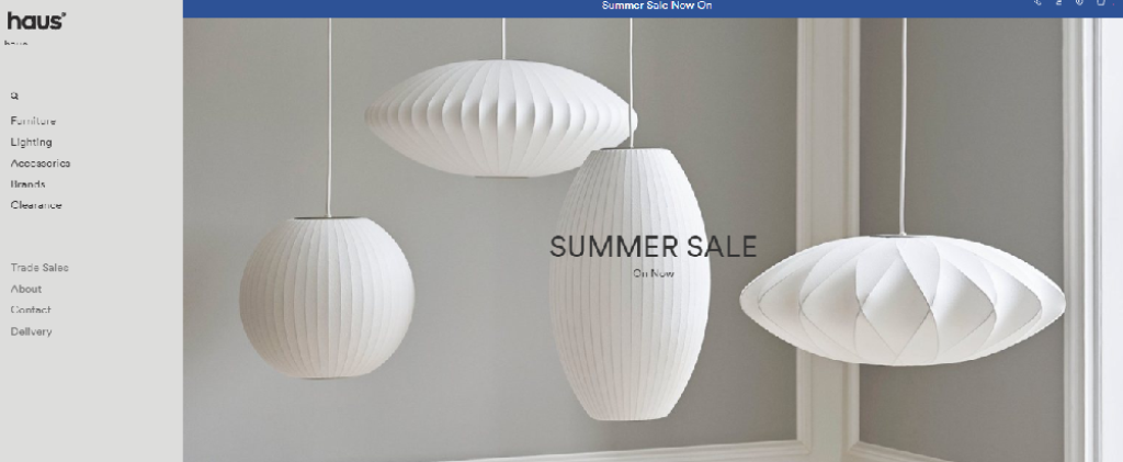
Haus London is a website selling contemporary furniture, lighting, and other homeware. Their mostly beige and white design sets a minimalist look on which they display their different products. Navigation is neatly laid out on the left side. The top banner displays their furniture from top design lines or seasonal furniture. Large text banners alert customers about sales and special offers.
Tluxe
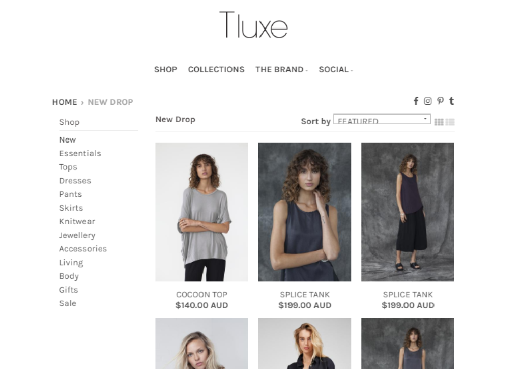
This Australian site, selling women’s apparel and accessories, showcases how well elegance and simplicity work together, to create a sleek, fast loading website. Their homepage conforms to the minimalist web design principle, with just a top banner, and an Instagram feed. The shop has a simple side panel navigation. Customers see professional photographs showing off the products.
QuadLock
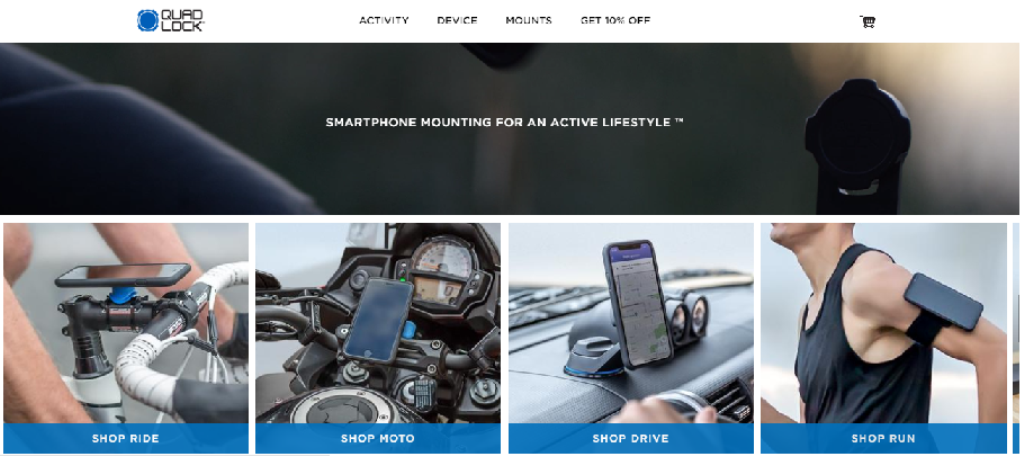
Go to the website and their top banner GIF animation at once shows off their main product line – their smartphone mounts. The GIF shows off all their products and the image carousel below this banner takes you to the different sections – Ride, Moto, Drive, Run, and Life. Simple, to-the-point, and easily takes you to where you want to go within the site. Below this, you see a clear, concise description of the product.
Brilliant
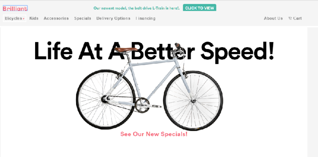
Their homepage says Life at a Better Speed, and this applies to their website too. Minimalist white background, a simple top navigation bar, a mostly text section highlighting their USPs, and a few simple images of their bicycles. Their homepage loads instantaneously. Bicycles have become so fancy and varied, it’s now hard for the customer to decide what he wants. Brilliant says they want to bring back the simplicity and fun of bicycling, and this idea reflects in their web design too.
Uppercase Magazine
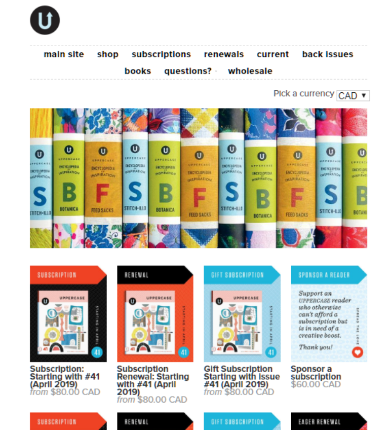
UPPERCASE, as they put it themselves, is a magazine for the “creative and the curious”. An attractive but single top banner, a grid of subscription offers below, and a top navigation bar completes their home page. The breadcrumbs at the top enable you to navigate back along the path you came. Simple, to the point, and attractive, this website focuses on the products and invites the customer to take action.
Death Wish Coffee
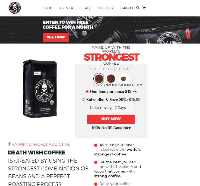
Everything about this website is bold and strong, right from their name to the fonts and colors. Common design wisdom says to make the least use of capitals, but they make use of uppercase font and it gels in with their product idea – bold, strong coffee. The banner colors, the text, the images are all bold, conveying a sense of strength. Their coffee, they say, uses the strongest combination of beans and a perfect roasting process. Their website uses a striking combination of colors, fonts, style, and content – blended together perfectly.
These nine websites, built on Shopify, show you how to implement good web design that’s simple yet attractive and gets the customer to take action. They have easy navigation and get the customer involved in the content, inviting them to buy, subscribe, or at least look at the products/services. These web designs can serve as an inspiration for you, giving you new ideas on how to present your own products.

